Visualizing progress in clean energies.
2020 | GOVernment
As part of its response to the Climate Emergency action plan, the city of Vancouver increased its electric vehicle charging network. With the support of Natural Resources Canada, the addition of stations included a new public art piece in its scope.
Conceptualized by the city’s engineering artist in residence, the art piece is a series of data points of the city’s progress towards clean energy. On a team with Plot+Scatter, Info and Such designed the data story or “scrollytelling.”
The project in brief
The need
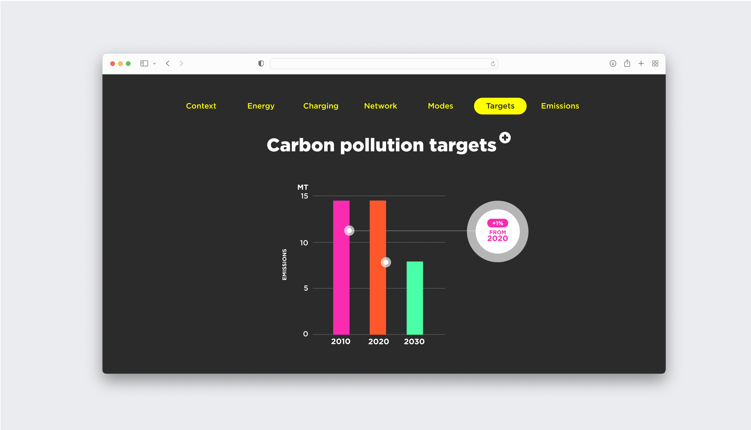
Turning data points into a browsable data story.
The solution
The services
Data Visualization, UX/UI Design.
The outcome
High Fidelity Mockups, UI Guide.
The project
On a team with Plot+Scatter I designed the data story of the city’s progress towards clean energy. A few key concepts drove the design:
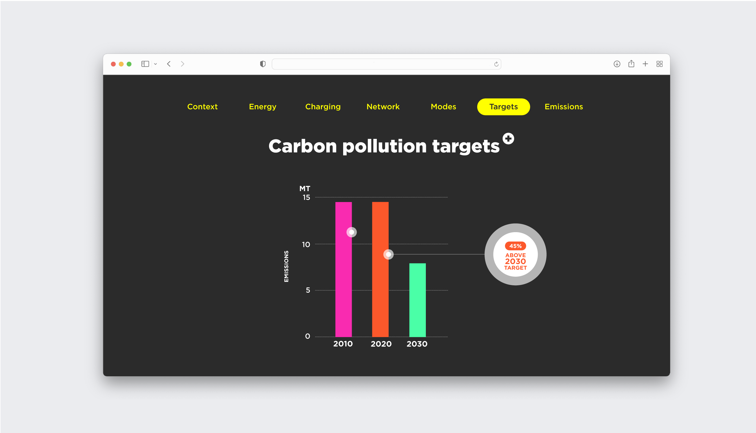
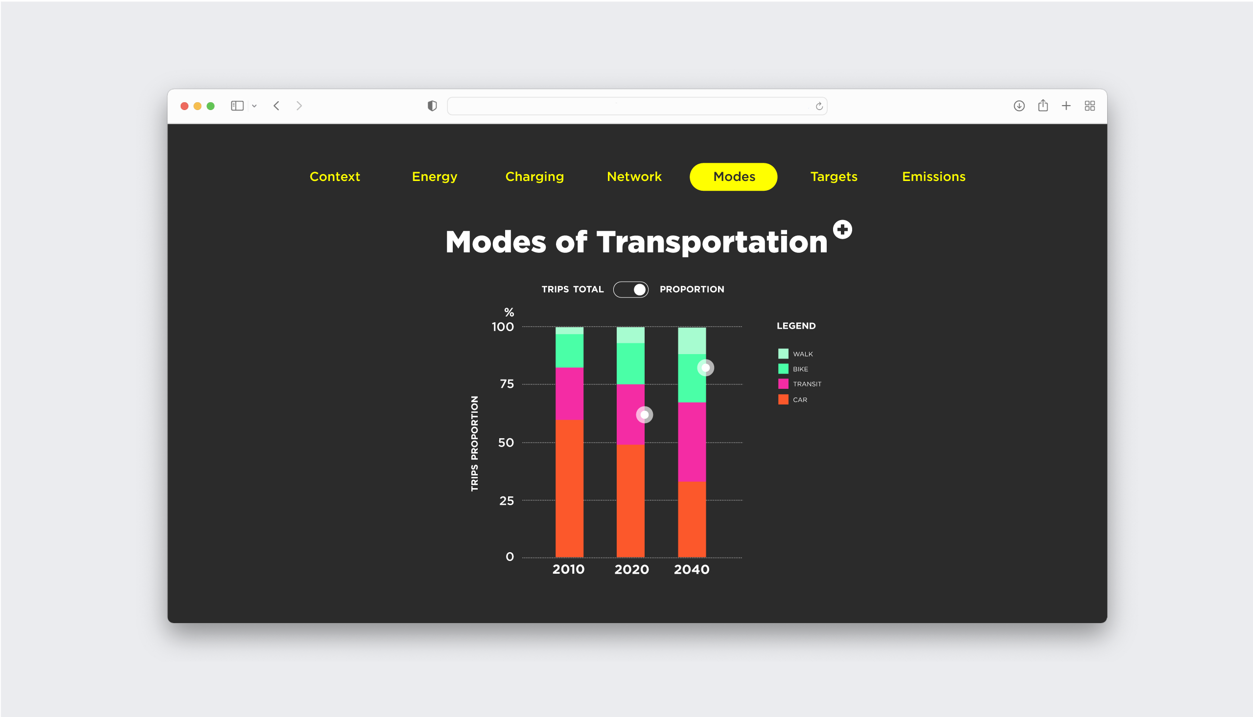
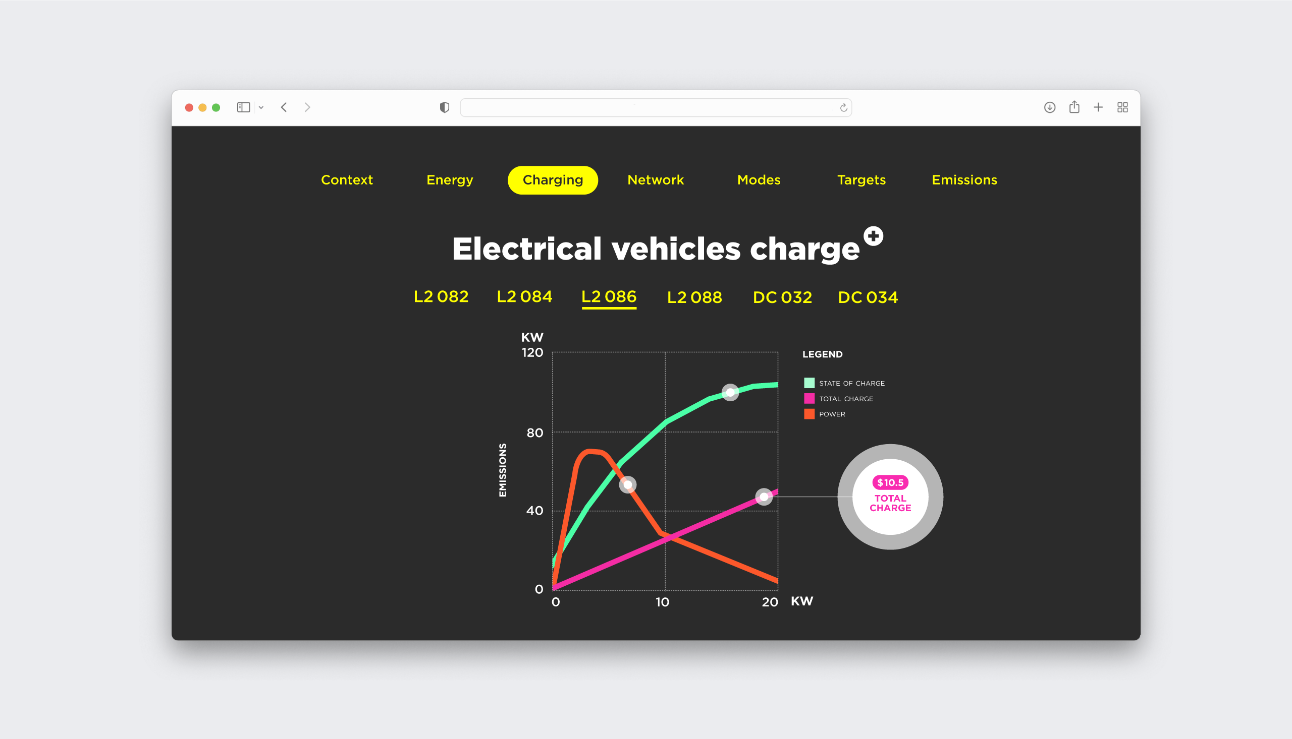
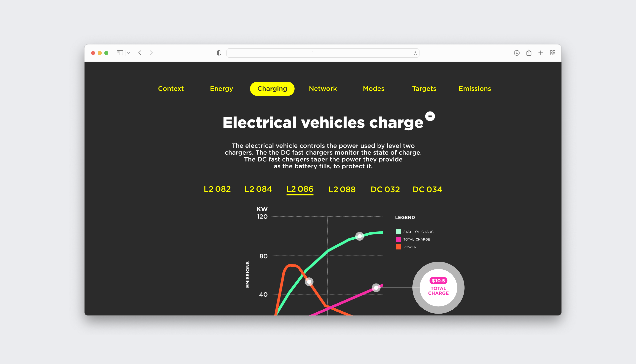
Focusing the story on electric vehicles
The data selected to tell the city’s clean energy story was mainly centred around a shift in transportation with the development of an EV network in the city. This was highlighted by the location of the piece that beyond existing online is placed as a public installation, on a touch screen, alongside EV charging stations at Vancouver City Hall. The graphic direction built on this EV focus in the story with a visual language that is ‘electric’ with high contrasts, light and dark themes and a neon colour palette.
Crafting the data story
Much of the storytelling exists through the structuring and ordering of content but also through the interactions at play in the interface. The choice here was to create a linear experience through a continuous scroll that allowed the story to be a straight forward progression.
Providing guidance for the data novice
The piece features a dozen interactive data visualizations to be explored and dived into. Visualizations can be toggled and reflowed while textual information can be expanded for more context. Each visualization, even when a basic bar chart, features hot spots that reveal a main takeaway of the visualized data offering a guided read for the data novice.