

Reviving a print archive for mobile.
2022 | PUBLISHING
Rungh is a Canadian magazine questioning and challenging ideas about diversity in the Canadian cultural landscape. First published as a quarterly print in the early 90’s, the cultural magazine was relaunched in 2017 as a digital platform.
In 2022 Rungh was creating Redux, an archive of their early print publication, one for the digital era. On a team with Plot+Scatter Info and Such designed the mobile archive.
Rungh Redux received the 2022 BC Museum Association Award of Merit for Innovative practice.
The project in brief
The need
A digital rendering of a print magazine.
The solution
An exploratory mobile experience of the archive retaining elements of the print.
The services
UX/UI Design, Creative Direction.
The outcome
High Fidelity Mockups, UI Guide.
The project
On a team with Plot+Scatter I designed a mobile experience for Rungh Redux. A few key concepts drove my design:
Retaining something of the physical print in the digital experience
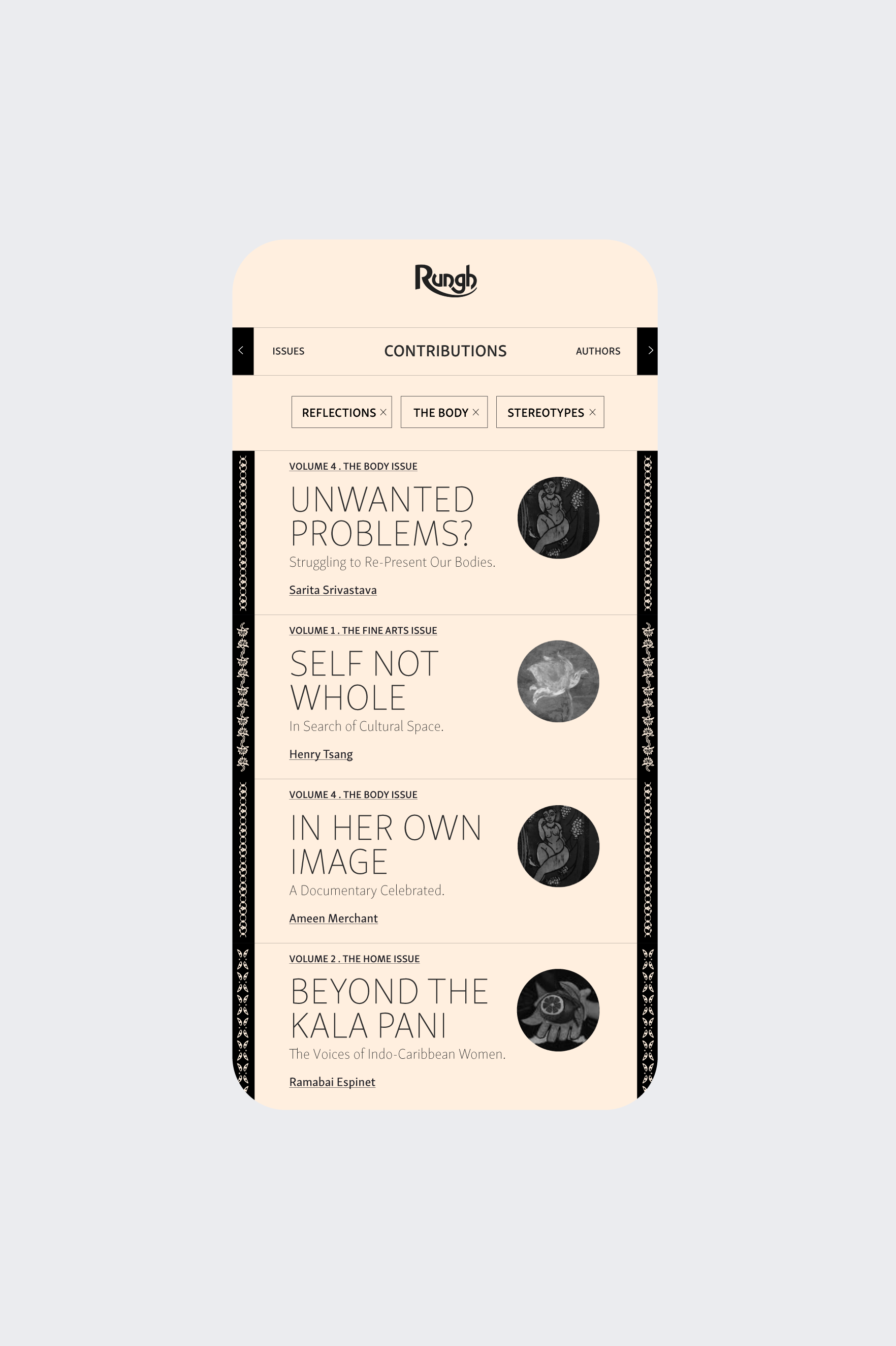
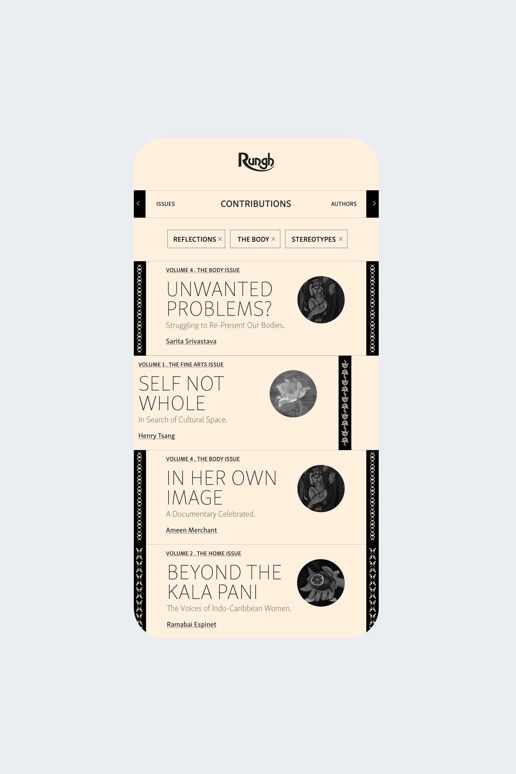
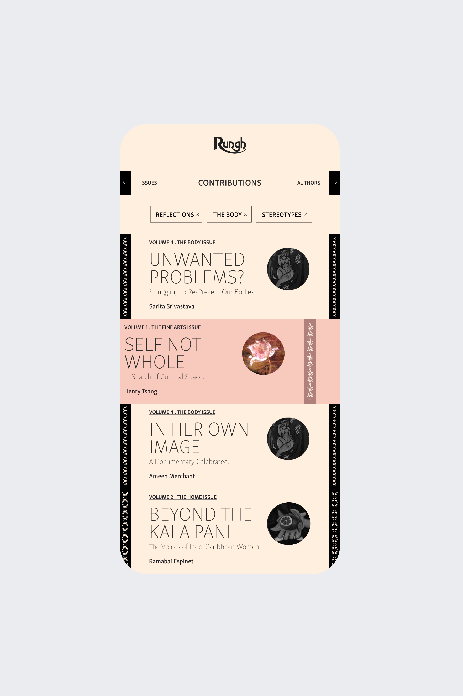
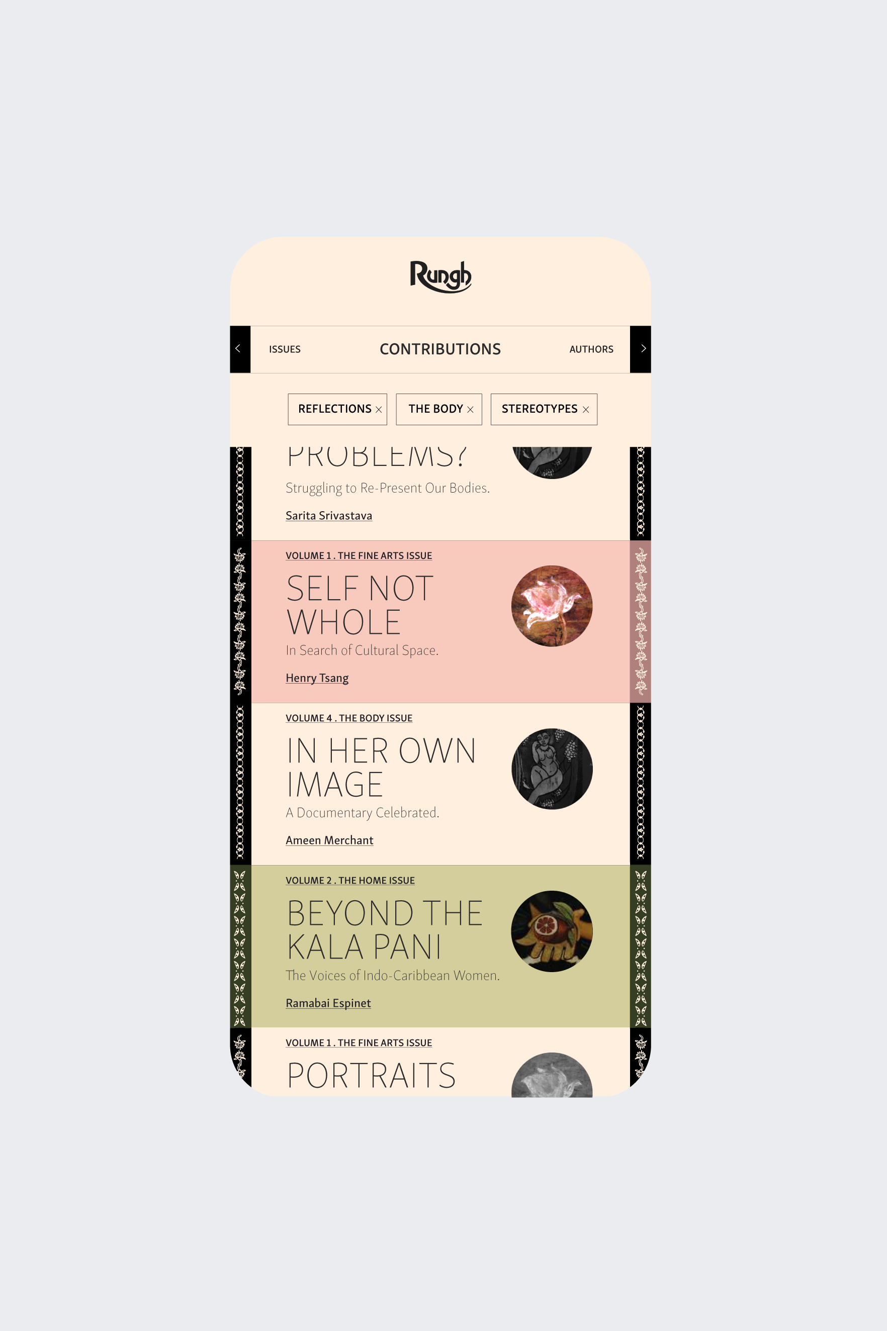
The original print magazine featured a distinct detail that created a unique graphic feel: each page of each issue had a beautiful hand painted frieze at the top and bottom of every page. Made of delicate patterns that evolved throughout the publication they ornate each contribution.
I iterated to retain these unique graphics in the digital rendering of the archive. They were integrated in the UI, framing each contribution, just like in the print, and also became part of the UX, as a navigation element. Functional they were turned into a key element of the interface, the way to swipe left and right for more content.
Providing a strong sense of place and highlighting the user’s progression
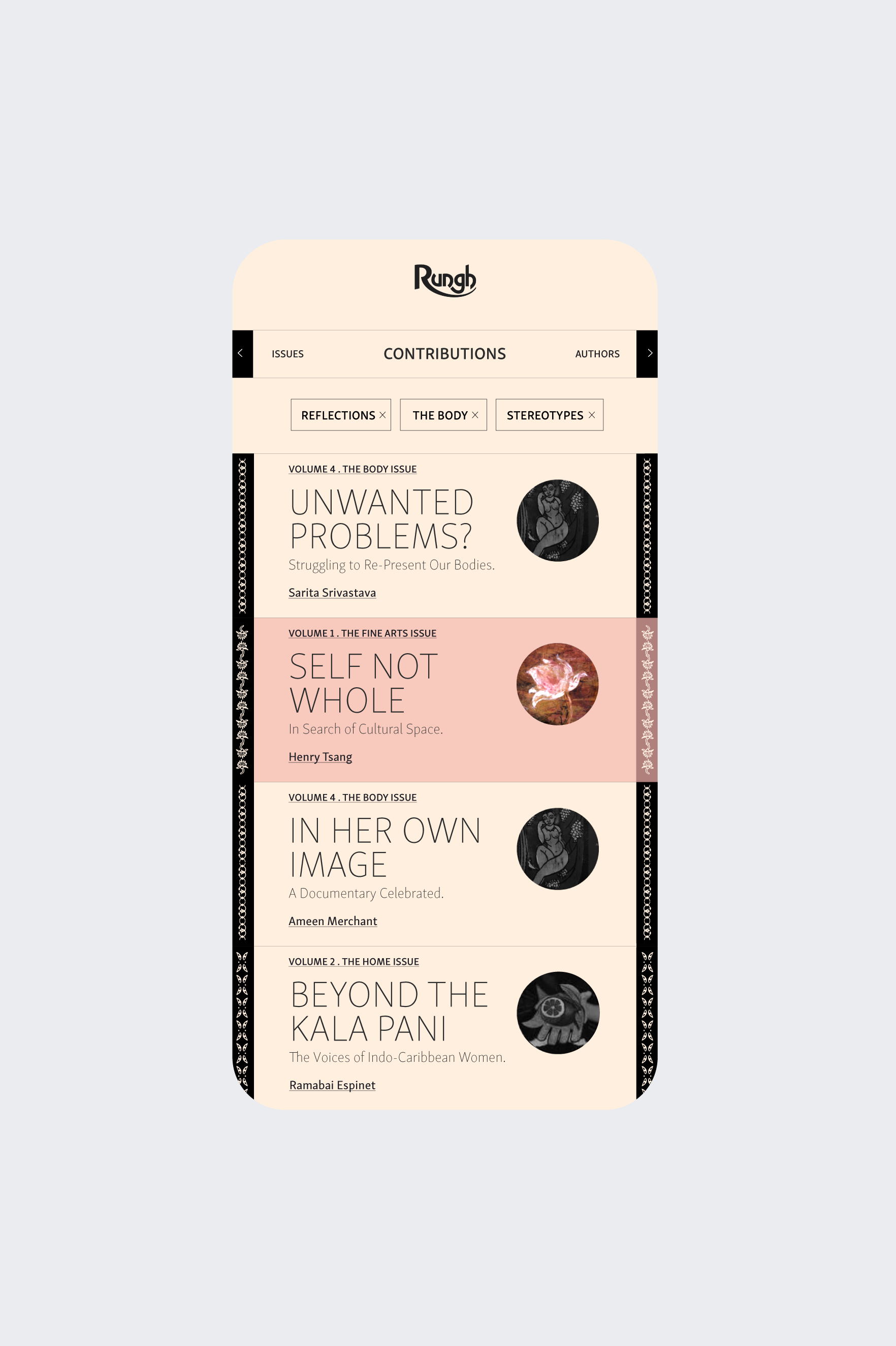
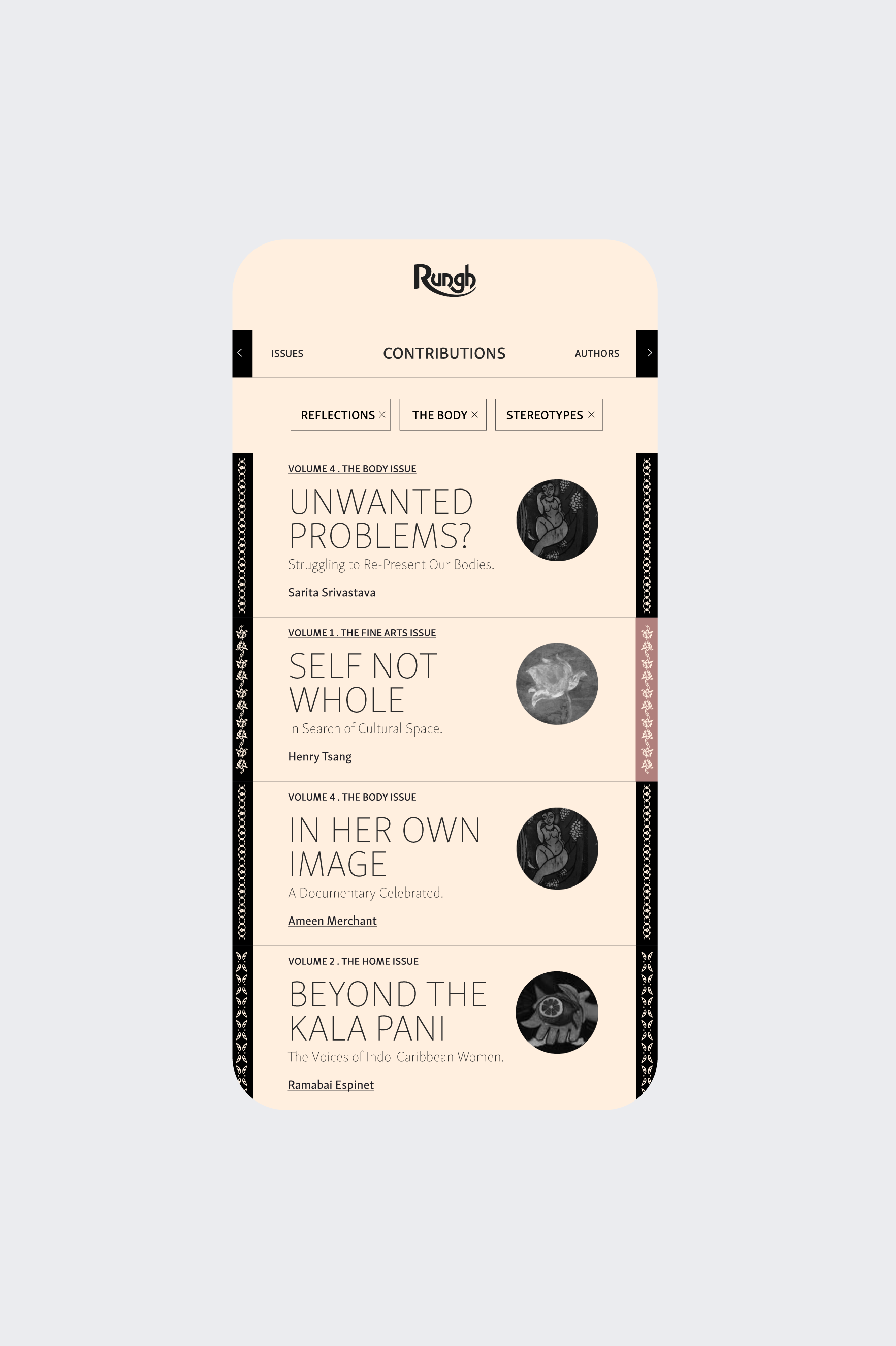
The content was split through three streams: issues, contributions and authors with each swipe rotating the user through one of these categories. A filter functionality allowed to filter the content across all categories by keywords. Beyond a robust categorizing of content there was also a need to highlight the journey of the user through the vast amount of content — over twenty issues in total.
This digital archive was about discovering, or re-discovering, content in a new light some thirty years later. From there stemmed the concept of a content that literally came to light as the user interacted with it. Once visited each piece of content became coloured in, tracing the journey of the user and bringing the platform from a duo-tone to a coloured experience.
Featuring the essence and singularity of each print issue
The palette that coloured the user’s journey was directly derived from the print archive — the original print issues had covers that were printed in full colour. Each issue was labeled with a colour while also featuring a sample of the original cover artwork that was retained in a badge like illustration that also come to light through the user journey.